
VW to Pixel Converter | Fast & Accurate Online Tool
VW to Pixel Converter (CSS Unit Calculator)
Calculate exact pixel values from CSS viewport width units instantly.
This free tool converts VW (Viewport Width) units into PX (Pixels) based on your specific screen size. Whether you are debugging a responsive layout or translating a Figma design into CSS, this calculator ensures your media queries and elements are pixel-perfect.
How to Convert VW to PX
-
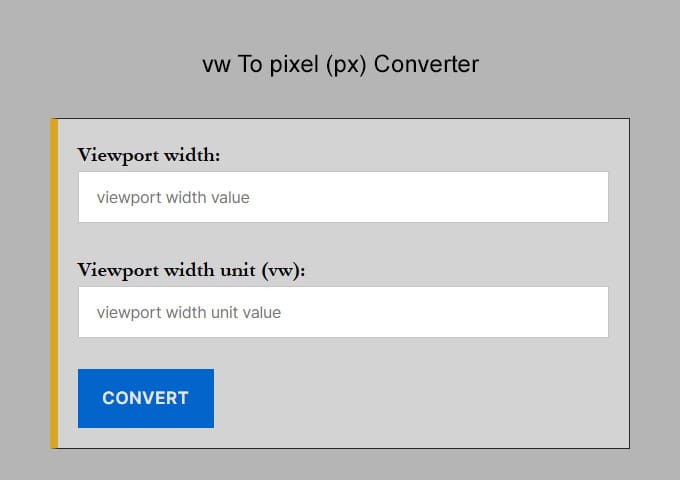
Enter Viewport Width: Input the total width of your screen or container (e.g.,
1920for desktop,375for mobile). -
Enter VW Value: Type the CSS
vwvalue you want to convert (e.g.,50). -
Get Result: The tool instantly calculates the equivalent pixel value.
The VW to PX Formula
The math behind converting Viewport Width to Pixels is simple. Since 1vw is equal to 1% of the viewport’s total width, the formula is:
Pixels (px) = (VW Value × Viewport Width) / 100
Example Calculation: If your screen width is 1920px and you want to convert 50vw:
(50 × 1920) / 100 = 960px
Why use VW units in CSS?
VW stands for Viewport Width. It is a relative CSS unit used in responsive web design. Unlike pixels (which are static), VW units scale automatically based on the size of the browser window.
-
1vw = 1% of the viewport width.
-
100vw = 100% of the viewport width (full screen).
Developers often use these units to create fluid typography. However, if you are working with a fixed design from Figma or Photoshop, you may need to go the other way. In that case, you can use our Pixel to VW Converter to find the exact viewport percentage for your fixed pixel values.
vw to Pixels (px) Conversion Table if viewport width is 1920
This is a chart for vw to px conversion results if the viewport width is 1920
| VW | Pixel |
|---|---|
| 1 vw | 19.2 px |
| 2 vw | 38.4 px |
| 3 vw | 57.6 px |
| 4 vw | 76.8 px |
| 5 vw | 96 px |
| 6 vw | 115.2 px |
| 7 vw | 134.4 px |
| 8 vw | 153.6 px |
| 9 vw | 172.8 px |
| 10 vw | 192 px |
| 11 vw | 211.2 px |
| 12 vw | 230.4 px |
| 13 vw | 249.6 px |
| 14 vw | 268.8 px |
| 15 vw | 288 px |
| 16 vw | 307.2 px |
| 17 vw | 326.4 px |
| 18 vw | 345.6 px |
| 19 vw | 364.8 px |
| 20 vw | 384 px |
| 21 vw | 403.2 px |
| 22 vw | 422.4 px |
| 23 vw | 441.6 px |
| 24 vw | 460.8 px |
| 25 vw | 480 px |
Frequently Asked Questions (FAQ)
How do I convert Pixels (px) to Viewport Width (vw)?
To convert pixels to vw, divide your target pixel value by the total width of your design canvas (e.g., Figma or XD artboard) and multiply by 100. For example, if your design width is 1920px and you want to convert a 48px element: (48 / 1920) * 100 = 2.5vw.
What is the formula for px to vw conversion?
The mathematical formula is: vw = (Target pixel value/viewport width)*100 This calculation ensures the element scales proportionally as a percentage of the browser window. 1vw is always equal to 1% of the total viewport width.
How many pixels is 1vw?
The pixel value of 1vw depends on the screen size. On a 1440px laptop, 1vw = 14.4px. On a 375px mobile device, 1vw = 3.75px. Because it is dynamic, it is the preferred unit for creating fluid layouts that look consistent across all devices.
Should I use vw or rem for font sizes?
While vw allows for fluid scaling, using it alone can make text unreadably small on mobile. Best practice is to use the CSS clamp() function. For example: font-size: clamp(1rem, 2.5vw, 2rem);. This uses vw for scaling but sets a minimum and maximum limit for accessibility.
What is the difference between % and vw?
The % unit is relative to the width of the parent container, while vw is always relative to the entire viewport width. Additionally, 100vw includes the browser's scrollbar, whereas 100% does not, which can sometimes cause horizontal scrolling issues.
What viewport width should I use for Figma designs?
Most modern designers use a base desktop width of 1440px or 1920px and a mobile width of 375px or 390px. When using this converter, ensure the "Base Viewport Width" field matches the width of the specific frame you are copying values from.