
PX to EM Converter (Free Instant Pixel to EM Calculator)
Welcome to the most accurate and easy-to-use Pixel to EM converter. This tool helps web designers and developers calculate scalable CSS units instantly.
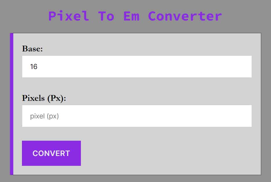
Simply enter your pixel value below, check your base font size (default is 16px), and get your EM value immediately.
You can convert pixels (px) to em using this converter accurately and quickly to save time and concentrate on what you are doing.
How to Convert Pixels to EM
Converting pixels to EM is essential for creating responsive, accessible websites. While pixels are static units, EMs are relative units that scale based on the parent element’s font size.
Need to go the other way? If you have an EM value and need to know the pixel equivalent, use our EM to Pixel Converter.
The PX to EM Formula
To calculate EM, you simply divide the desired pixel size by the parent element’s font size (usually the browser default).
EM = Pixels/Base Font Size
Example: If your base font size is 16px (standard for most browsers) and you want a font size of 24px:
1.5em = 24px/16px
Pro Tip: The standard base font size for most browsers is 16px. Unless you have changed the font-size on your html or body tag in CSS, you should stick with 16 as your base.
Video Tutorial: How To Use Pixels To Em Converter
Why Use EM Instead of PX?
Modern web standards (W3C) and SEO best practices recommend using relative units like EM or REM over fixed units like PX.
-
Accessibility: Users who have vision impairments often increase their browser’s default font size. If you use Pixels, your site will not scale for them. If you use EM, your layout adjusts automatically to their preferences.
-
Responsive Design: EM allows elements to scale proportionally relative to their container, making it easier to build complex, responsive components like navigation bars and buttons.
-
Maintenance: By changing a single base font size in your CSS, you can scale typography across your entire website instantly.
Quick Comparison: PX vs. EM vs. REM
Many developers confuse EM and REM. Here is the breakdown:
| Unit | Type | Definition | Best Use Case |
| PX | Absolute | Fixed size. One pixel is one dot on the screen. | Borders, shadows, and precise alignment. |
| EM | Relative | Relative to the parent element’s font size. | Components where sizing depends on the container (e.g., padding inside a button). |
| REM | Relative | Relative to the root (HTML) font size. | Global typography, margins, and general layout spacing. |
Pixels to em Conversion Table if text size (base) is 16
This is a chart for px to em conversion if the text size is 16.
| Pixel | Em |
|---|---|
| 1 px | 0.0625 em |
| 1.6 px | 0.1 em |
| 2 px | 0.125 em |
| 3 px | 0.1875 em |
| 3.2 px | 0.2 em |
| 4 px | 0.25 em |
| 4.8 px | 0.3 em |
| 5 px | 0.3125 em |
| 6 px | 0.375 em |
| 6.4 px | 0.4 em |
| 7 px | 0.4375 em |
| 8 px | 0.5 em |
| 9 px | 0.5625 em |
| 10 px | 0.625 em |
| 11 px | 0.6875 em |
| 11.2 px | 0.7 em |
| 12 px | 0.75 em |
| 12.8 px | 0.8 em |
| 13 px | 0.8125 em |
| 14 px | 0.875 em |
| 14.4 px | 0.9 em |
| 15 px | 0.9375 em |
| 16 px | 1 em |
| 17 px | 1.0625 em |
| 17.6 px | 1.1 em |
| 18 px | 1.125 em |
| 19 px | 1.1875 em |
| 19.2 px | 1.2 em |
| 20 px | 1.25 em |
| 21 px | 1.3125 em |
| 22 px | 1.375 em |
| 23 px | 1.4375 em |
| 24 px | 1.5 em |
| 25 px | 1.5625 em |
| 28 px | 1.75 em |
| 28.8 px | 1.8 em |
| 32 px | 2 em |
| 36 px | 2.25 em |
| 40 px | 2.5 em |
| 48 px | 3 em |
| 56 px | 3.5 em |
| 64 px | 4 em |
| 72 px | 4.5 em |
| 80 px | 5 em |
| 88 px | 5.5 em |
| 96 px | 6 em |
| 100 px | 6.25 em |
| 104 px | 6.5 em |
| 112 px | 7 em |
| 120 px | 7.5 em |
| 128 px | 8 em |
| 136 px | 8.5 em |
| 144 px | 9 em |
| 150 px | 9.375 em |
| 152 px | 9.5 em |
| 160 px | 10 em |
| 168 px | 10.5 em |
| 176 px | 11 em |
| 184 px | 11.5 em |
| 192 px | 12 em |
| 200 px | 12.5 em |
| 300 px | 18.75 em |
| 400 px | 25 em |
| 600 px | 37.5 em |
| 800 px | 50 em |
| 1024 px | 64 em |
| 1200 px | 75 em |
Frequently Asked Questions (FAQ)
How many pixels are in 1em?
In most modern browsers, the default font size is 16 pixels, meaning 1em is equal to 16px. However, EM is a relative unit; if the parent element has a different font size, 1em will equal that specific value.
Is 1em always 16px?
Not always. 1em is equal to the current font size of the element. However, if no font size is set on the page, browsers default to 16px. Therefore, 1em=16px is the standard starting point.
What is the formula to convert PX to EM?
The formula is: EM=Pixels / Target Font Size. For example, if your base font size is 16px and you want to convert a 24px element, the calculation is 24 / 16=1.5em.
Why should I use EM instead of PX for web design?
EM units are preferred for responsive design and accessibility. Unlike fixed pixels, EMs scale based on user browser settings, ensuring that text remains readable for visually impaired users who may increase their default font size.
What is the difference between EM and REM?
The EM unit is relative to the font size of its nearest parent element, which can lead to “compounding” (nested sizes getting larger). The REM (Root EM) is always relative to the root element (usually the html tag), providing more global consistency.
How do I convert 16px to EM?
Assuming the standard browser default of 16px, 16px is exactly 1em. If you use a “62.5% font-size” hack (setting the base to 10px), then 16px would become 1.6em.
Is it better to use EM or REM for media queries?
Many developers prefer EMs for media queries because they adapt more reliably when a user zooms in or changes their browser default font size, helping the layout stay proportional.