
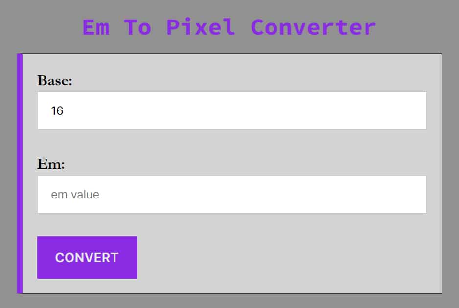
Em to PX Converter (Online Calculator & Conversion Formula)
Easily convert CSS Em units to Pixels (px) with this free online calculator. Whether you are a web developer or a UI designer, this tool helps you translate relative scalable units into precise pixel values for your stylesheets.
How to Convert Em to PX
While our calculator handles the math instantly, it is important for developers to understand the logic behind the conversion. If you are starting with pixels and need to go the other way, you can use our Pixel to Em Converter.
The calculation depends entirely on the Base Font Size of the parent element (or the browser default if no parent size is set). Most modern browsers (Chrome, Firefox, Safari) have a default base font size of 16px.
The Em to Pixel Formula
To calculate pixels from ems, use this simple equation:
Pixels = EM * BaseSize
Example: If your base font size is 16px and you have an element set to 2em:
32px = 2em * 16
Why is the Base Size important?
The em unit is relative. If you change the font size of the parent container, the value of the em inside it changes.
-
If the parent is 16px,
1em= 16px. -
If the parent is 20px,
1em= 20px.
Video Tutorial: How To Use Em To Pixels Converter
Em vs. PX: Which should you use?
1. Pixels (px)
Pixels are absolute units. They are fixed-size units that map to a single dot on the screen.
-
Pros: Precise control; the layout looks exactly the same on every device.
-
Cons: Not accessible. If a user changes their browser’s default font size settings (e.g., for visual impairment), pixel-defined text will not scale up.
2. Ems (em)
Ems are relative units. They scale relative to the font size of their parent element.
-
Pros: Excellent for responsive design and accessibility. Components built with
emscale naturally if the user zooms in or changes their browser settings. -
Cons: The “compounding effect.” If you nest multiple elements with
emvalues, they multiply each other, which can lead to unexpectedly large or small text.
Pro Tip: For spacing (padding/margin) and component sizing, em is often preferred because it keeps the component’s whitespace proportional to its text size.
Common Em to PX Conversions
Use this quick reference table for standard CSS values (based on the industry-standard 16px root font size).
| Em | Pixel |
|---|---|
| 0.0625 em | 1 px |
| 0.1 em | 1.6 px |
| 0.125 em | 2 px |
| 0.1875 em | 3 px |
| 0.2 em | 3.2 px |
| 0.25 em | 4 px |
| 0.3 em | 4.8 px |
| 0.3125 em | 5 px |
| 0.375 em | 6 px |
| 0.4 em | 6.4 px |
| 0.4375 em | 7 px |
| 0.5 em | 8 px |
| 0.5625 em | 9 px |
| 0.625 em | 10 px |
| 0.6875 em | 11 px |
| 0.7 em | 11.2 px |
| 0.75 em | 12 px |
| 0.8 em | 12.8 px |
| 0.8125 em | 13 px |
| 0.875 em | 14 px |
| 0.9 em | 14.4 px |
| 0.9375 em | 15 px |
| 1 em | 16 px |
| 1.0625 em | 17 px |
| 1.1 em | 17.6 px |
| 1.125 em | 18 px |
| 1.1875 em | 19 px |
| 1.2 em | 19.2 px |
| 1.25 em | 20 px |
| 1.3125 em | 21 px |
| 1.375 em | 22 px |
| 1.4375 em | 23 px |
| 1.5 em | 24 px |
| 1.5625 em | 25 px |
| 1.75 em | 28 px |
| 1.8 em | 28.8 px |
| 2 em | 32 px |
| 2.25 em | 36 px |
| 2.5 em | 40 px |
| 3 em | 48 px |
| 3.5 em | 56 px |
| 4 em | 64 px |
| 4.5 em | 72 px |
| 5 em | 80 px |
| 5.5 em | 88 px |
| 6 em | 96 px |
| 6.25 em | 100 px |
| 6.5 em | 104 px |
| 7 em | 112 px |
| 7.5 em | 120 px |
| 8 em | 128 px |
| 8.5 em | 136 px |
| 9 em | 144 px |
| 9.375 em | 150 px |
| 9.5 em | 152 px |
| 10 em | 160 px |
| 10.5 em | 168 px |
| 11 em | 176 px |
| 11.5 em | 184 px |
| 12 em | 192 px |
| 12.5 em | 200 px |
| 18.75 em | 300 px |
| 25 em | 400 px |
| 37.5 em | 600 px |
| 50 em | 800 px |
| 64 em | 1024 px |
| 75 em | 1200 px |
Frequently Asked Questions (FAQ)
How do I convert em to pixels (PX)?
To convert em to pixels, multiply the em value by the base font size of the parent element. Formula: Pixels=em × Base Font Size. Example: If your base font size is 16px, then 2em is 2 × 16=32px.
What is an Em unit?
An “em” is a CSS unit that stands for the current font size of the element. Historically, it represented the width of the capital letter “M” in typography. Today, it is a scalable unit used to create responsive web layouts.
Is Em better than PX for mobile design?
Generally, yes. Using relative units like em or rem ensures that your content remains readable regardless of the device’s resolution or the user’s personal browser settings.
What is the default browser font size for em conversion?
In 2026, most modern browsers still use a default base font size of 16px. Unless you have explicitly changed the font size in your CSS (e.g., on the body or html tag), 1em will equal 16px.
What is the difference between em and rem?
While both are relative units, em is relative to the font size of its parent element, whereas rem (Root em) is always relative to the root HTML element (usually the html tag). This makes rem more predictable for consistent sizing across a site.
Is it better to use em or pixels (PX) for web design?
em is generally better for responsive design because it allows elements to scale proportionally with text size. Pixels provide absolute precision but may not adapt as well to user-defined browser settings or different device scales.
How do I find my website’s base font size?
You can find the base font size by inspecting your site using browser developer tools (F12). Check the Computed tab for the font-size property on the html or body element. If none is set, it defaults to 16px.
Does using pixels make my site less responsive?
Not necessarily, but it can make it less “fluid”. If you use fixed pixel values for everything, the layout won’t automatically adjust if a user increases their browser’s default font size for accessibility. Using relative units like em or rem ensures the design respects user preferences.