
Percentage to Pixel Converter | % to PX Calculator
Are you a web developer, UI/UX designer, or digital artist working on responsive layouts? Converting percentages (%) to pixels (px) is a crucial step in translating flexible CSS designs into precise screen measurements.
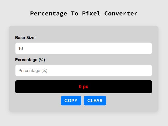
Use our free, fast, and accurate Percentage to Pixel Converter to streamline your front-end workflow. Simply enter your base value and percentage, and let the tool do the math!
How to Convert Percentages to Pixels (Online & Manually)
When building responsive websites, you frequently need to switch between relative units (percentages) and absolute units (pixels). While using our online calculator above is the quickest method, understanding the math behind the conversion can help you write better CSS and JavaScript.
The Percentage to Pixels Formula
To manually convert a percentage into pixels, you first need to know the Base value. This is typically the width of a parent container, a screen resolution, or a root font size (often 16px). Once you know the base, use this simple equation:
Pixel (px) = (Percentage × Base) / 100
Example Calculation:
Imagine you have a parent container that is 1200px wide (your Base), and you want a child <div> element to take up 45% of that width.
- Pixel (px) = (45 × 1200) / 100
- Pixel (px) = 54000 / 100
- Result: The element will be 540px wide.
Need to do the reverse calculation for your stylesheet? Check out our Pixel To Percentage Converter to quickly turn your static pixel measurements into fluid, responsive percentages.
Video Tutorial: How To Convert Percentage To Pixels
Why Use an Online % to PX Calculator?
- Responsive Web Design: Easily calculate the exact pixel width or height of UI elements when translating a Figma, Photoshop, or Adobe XD mockup into a responsive CSS Grid or Flexbox layout.
- Typography & Font Sizes: Quickly find out what a percentage-based font size (e.g.,
150%) equals in pixels based on the browser’s default root font size. - Save Time: Eliminate manual math errors and speed up your web development process.
Percentage to Pixels Conversion Table
For quick reference, here is a handy cheat sheet. This table assumes a standard base value of 16px, which is the default root text size in most modern web browsers.
| Percentage | Pixel |
|---|---|
| 62.5 % | 10 px |
| 125 % | 20 px |
| 312.5 % | 50 px |
| 625 % | 100 px |
| 781.25 % | 125 px |
| 937.5 % | 150 px |
| 1000 % | 160 px |
| 1250 % | 200 px |
| 1375 % | 220 px |
| 1562.5 % | 250 px |
| 1750 % | 280 px |
| 1875 % | 300 px |
| 2187.5 % | 350 px |
| 2500 % | 400 px |
| 2812.5 % | 450 px |
| 3125 % | 500 px |
| 3437.5 % | 550 px |
| 3750 % | 600 px |
| 4062.5 % | 650 px |
| 4375 % | 700 px |
| 4687.5 % | 750 px |
| 5000 % | 800 px |
| 5312.5 % | 850 px |
| 5625 % | 900 px |
| 5937.5 % | 950 px |
Frequently Asked Questions (FAQs)
How many pixels is 100%?
The number of pixels in 100% depends entirely on your base value. If your parent container is 800px wide, then 100% equals 800px. If you are calculating typography and your base font size is 16px, then 100% is 16px.
How do I convert % to px in CSS?
CSS handles percentage to pixel conversion automatically based on the parent element’s dimensions in the browser. However, if you are calculating fixed fallback values, writing complex calc() functions, or using JavaScript to manipulate DOM dimensions, you will need to calculate the exact pixel value using our converter.
Are percentages better than pixels in web design?
Percentages are ideal for responsive, fluid designs (such as the widths of columns and containers) because they automatically adapt to different screen sizes. Pixels, on the other hand, are better when you need absolute, fixed dimensions (like thin borders, small icons, or max-widths) that shouldn’t change regardless of the device.